Creative Imaging.
websites
|
Could also be the worst Website of All Time
I don't know what to say about this god-awful abomination of a website. It has:
I first started looking at a site on religion, i was overwhelmed with the amount of pictures, gifs and information that was being crammed onto the home page. it was clutted and unorganised and i found it difficault to navagate my way around the website. the main purpose for this website was unable to be identified, the page was just a collection of animated images and unecessary visual information. this made the page run very slow and regulary crashed and froze, this made using the site frustrating and complicated. there was no where for your eyes to rest causing a headache. there was also lopped 8 bit music in the backgroun of the site, it unabled me from being able to concentrate on the information that i am trying to read.
|

THIS SITE MIGHT CAUSE SEIZURES |
|
This a classic example of everything a website shouldn't be.
As one commenter stated: The amount of animated GIFs causes slow loading times and something in the page caused my mouse to throw a fit and I had to shut the machine down to get it working again. However, the site has a guestbook with favourable comments about how cheerful it is, so the visitors obviously love it and, despite what I think, it does fulfill its purpose as a religious site. The first thing everyone says when they open that page is JEEZUS!!!! |

|
|
In contrast, Andy Gotts' website is simple, modern and tidy. The website was clearly labled and very easy to navigate and understand. There were no unnecessary gifs or images that would have led to disraction, only several bold images where your eyes could rest. The page was clear and only showed the images that he wanted people to see. It was clear to see what the website wanted to convey. Also as the website is simple it runs very well and is very effective.
|


|
|
|
My magazine design.
|
I began with an idea of making a front cover of a magazine which was inspired by the big issue. My first attempt was dull and the text did not stand out, there was also no scale to the photo, for example the rubbish did not look vast, it simply looked like a pile of normal junk which was not very effective. In order to improve this and to make the rubbish appear as big as the problem actually is, I had to make some alterations. |

|
|
The rubbish being big conveys the idea that the problems caused by rubbish are also big. To make the rubbish appear larger I added a figure that I made from wool in front of it, this created the effect of an overpowering pile of junk looking as if it is towering over this character. However I did decide to change the background because it was too dark. After changing this and making the picture lighter it automatically looked more official and professional. I then looked through my daughters 'we love pop' magazine and found a style of text box that I could use to make my font and writing stand out over the picture it works really well with a busy back ground and made the text much easier to read. I then decided to make a magazine and add information appropriate to the context of the title. I am very glad I decided to do more with the front cover, it is clean and tidy and with more time and more research I could have added more pages and info, but I had insufficient time. |

|
My movie poster design.
|
I decided to do a poster in portrait orientation as that is how they are displayed in the local cinema. screenshot 1 I began with a photo of a landscape made from recycled material portraying a track in the woods. screenshot 2 I then researched The Lord of the Rings text and downloaded two free fonts (Aniron and Ringbearer) from this website: www.thehutt.de/tolkien/fonts.html. I applied these fonts to the title above the landscape photo on photoshop and added a green outer glow to highlight the text and make it stand apart from the background, the green/blue glow also ties the text to the background and makes fit the theme of the image. |
|
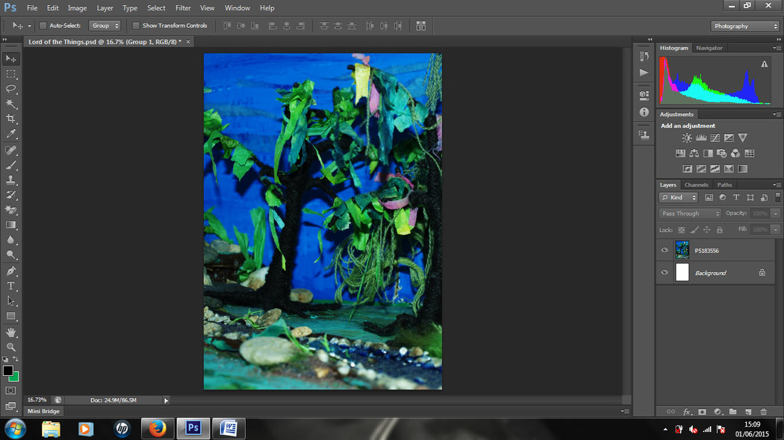
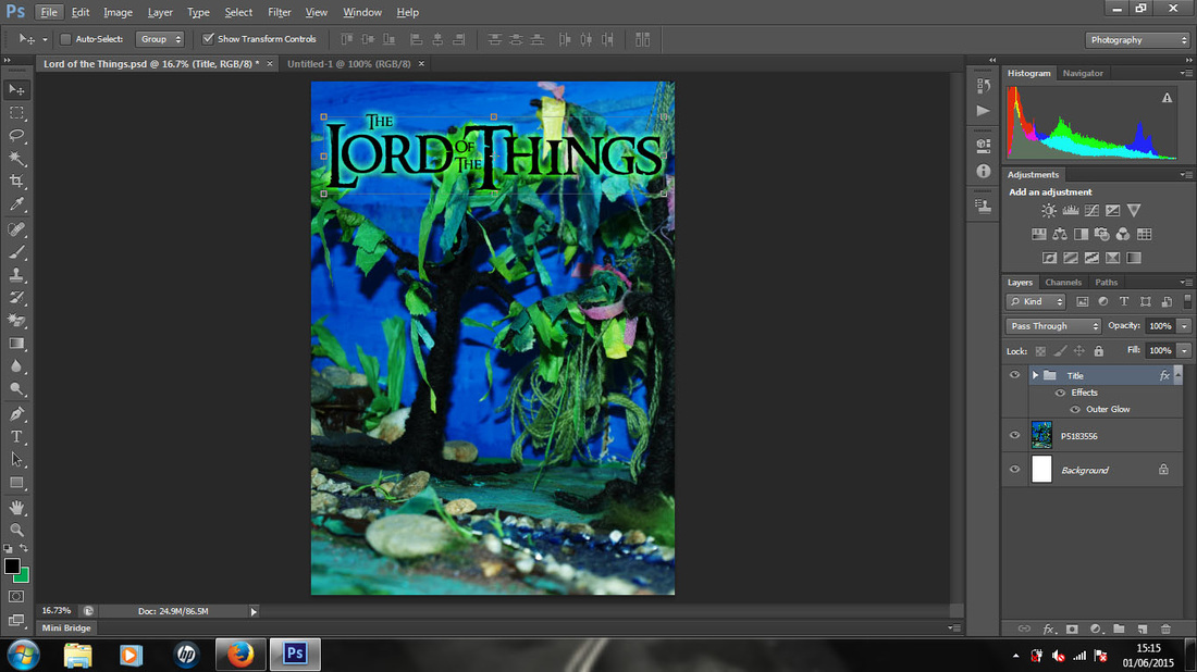

screenshot 3
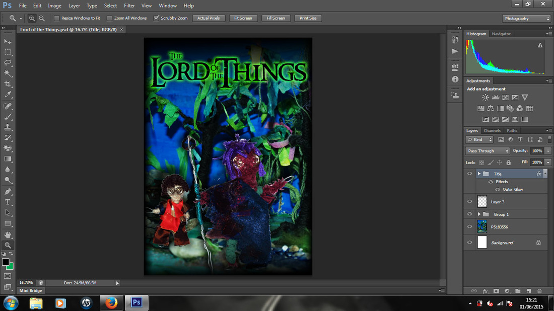
Then I added my adventurer made from junk, i resized and placed them as if they were walking along a path in the woods on a quest, as in the film "The Lord of the Rings".
Putting a drop shadow on the figures really helped to make them merge into the photo as there were no sharp edges on the figures.
screenshot 4
After more research from movie posters of The Lord of the Rings, i decided to add dark edging to the image as this is used alot within film advertisment, ether at the top or bottom of the image or even on all sides. I decided to darken all sides of the image as I decided the effect looked best for this image.
Gig Flyer
|
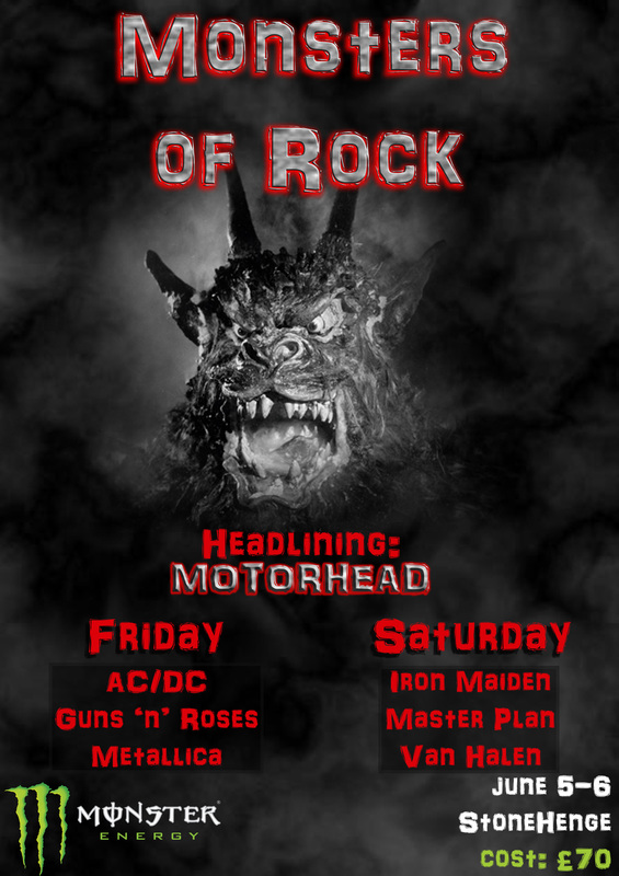
I decided to make my own gig/festival flyer, after going to many gigs and I have seen some really good flyers and some that are not so good. I think the key to a good flyer is to limit what you add on them so it is easier to take in the information. Stick to the minimal that is needed i.e. date, location and price to avoid over-filling the flyer. If any big bands are coming add them onto the flyer as this will attract people to come.
If you add to much information it becomes hard to find the main information fast. You need this info to be taken in fast if your target audience are hanging out in a club or pub as people won’t want to have to sit and read a lot when they’re out having fun. I decided to make the Monsters of Rock title resemble rock in order to symbolise rock music, I feel this has worked well. I also limited the colour pallet in the background so as not to distract from the information provided on the flyer. I added red to the text of the name and bands to catch the eye, this stood out very well on the monochrome background. However the brightness of the red made the text in the band listing difficult to read so I added a semi-transparent box behind the text to provide a better contrast. |
|
Bus advertisment
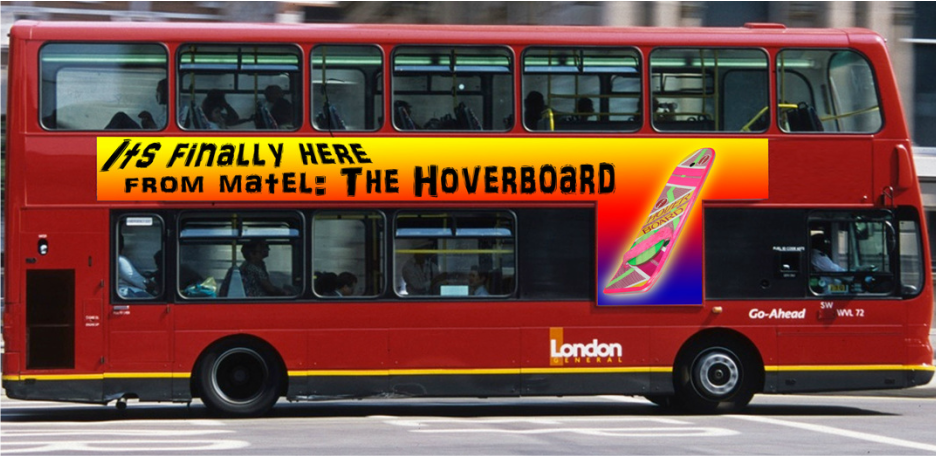
I decided to try and design an advertisment for the side of a bus, however it was more difficult than it first appeared, to fit a useable image into the provided space. This limited the complexity of the design so therefore i chose to use a basic design with a retro theme, however i feel that these colours did not fit with the colour of the bus. If i had to repeat this design i would choose a more muted colour scheme and try to portray the retro/80's theme with the text.
Logos
|
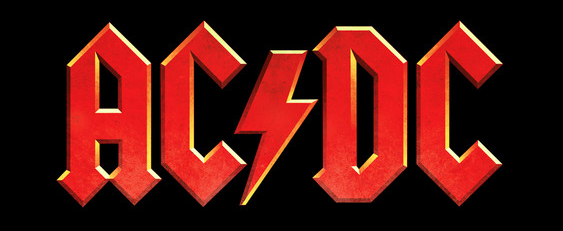
The lightning bolt within the logo and the name of the band, AC DC, is a terminology for the two types of electrical cunnent and is a good example of semiotics. |
|
At the beginning of this project, i thought that creative imaging was alot easier than it is.
I had no idea about equal spacing, textbox layouts, how many different fonts there are, making sure that the colour tones are in harmony, or if you want to make the text pop out with a different colour make sure that it doesn't clash with the background.
I enjoyed learning new skills required to create defferent types of imagery.
Bibliography
http://designercrossbodybags.com/wp-content/uploads/2014/12/great-pacific-garbage-patch-from-plane.jpg
http://www.bagmonster.com/wp-content/uploads/md2.jpg
http://www.theyucatantimes.com/wp-content/uploads/2014/11/PAY-Joyxee-Bottle-Island4.jpg
http://i.ytimg.com/vi/GnLhWpy_nqI/maxresdefault.jpg
i.huffpost.com/gen/1438528/images/o-PILES-OF-TRASH-facebook.jpg
http://ak.picdn.net/shutterstock/videos/4953440/preview/stock-footage-smoke-floating-through-space-against-black-background-illuminated-from-the-right-side.jpg
http://cdn.spectator.co.uk/wp-content/uploads/2013/11/Night-of-the-Demon.jpg
http://www.globalviewmedia.co.uk/wp-content/uploads/2012/12/Bus-T-Side.jpg
http://www.propstore.com/content/collectionimages/backtothefuture2/img1.jpg
http://cdn.iphonehacks.com/wp-content/uploads/2012/11/acdc-logo.png
